Monday, June 07, 2010
Anybody Care About Quality Anymore?
Is there anybody out there who still cares about quality photography? If I have to talk to another company who ultimately decides to shoot it themselves on their conference table, I think I'll go nuts. It didn't used to be like this. Previously, the professional Graphic Designer/Art Director acted as a gatekeeper of quality. They made sure that the images used in their designs were high quality, beautiful things. It made their designs look good. It made the company look good.
With the advent of easy to use design programs and web page creators, a lot of companies are doing their own design-layout for print and web page creation. Often the results are horrendous. If you are creating marketing material without the help of a real Graphic Designer or Art Director, (web site coders don't count), see below.
Facts:
- Your nephew with the great new camera is not equivalent to a trained professional photographer with 30 years experience in shooting products in the studio. Sorry.
- Buying design software does not make you or any of your employees a Graphic Designer!
- Customers do notice the difference. Quality images denote quality product.
Leave some comments about this rant. Anybody have any clients who don't care about quality?

Thursday, June 03, 2010
Chesapeake Bay Crabcakes

We recently spent several days shooting crab cakes for Chesapeake Bay Crabcake Co. Stephanie Rose styled the food.

Stephanie in the studio kitchen. Does she really need all this to style crabcakes?

Stephanie on set with some friends.


At the end of the shoot, we got to take home a bunch of frozen crabcakes and even some lobster tails. Thanks Alex & Doug. They were great!
Tuesday, June 01, 2010
Interns & Violin
I hosted two high school interns, Lauren Walters & Ike Pappas, here at the studio for a couple of weeks. We were kinda slow during that period but they did get to help with a couple of studio set ups. They also learned to vacuum!


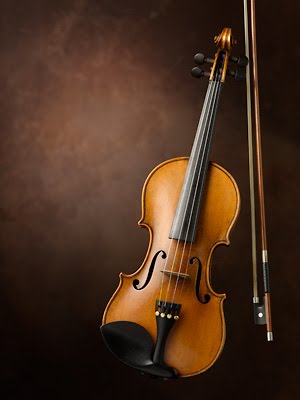
This is one of the final images.

Lauren & Ike help build the set. Now they know all about C-Stands and sandbags.

Here you can see the set up. The violin is hung up by fishing line and the block beneath will be removed in Photoshop. The scrim on the left provides a soft gradating light and foamcore on right and below is used as a reflector to keep the shadows from becoming too dark.

At one point the 100 year old violin slipped off the block and swung wildly from the fishing line. Lauren saved it!

Of course, Ike helped too.

This is another version with a more rustic background. More of a Bluegrass feeling.
Monday, March 29, 2010
Port Wine
Tom Sadowski art directed a Port wine bottle setup that turned out nicely. The ultimate client was The Center for Wine Origins.

 The set up looked like this, except by the time I shot this the glasses had already been removed.

This was one of the first test images. The red background is rather bland and we needed to add some sparkle.
 I added some shiny reflective pieces of fabric on the red material to get some "random" looking highlights. You can see them on the left.
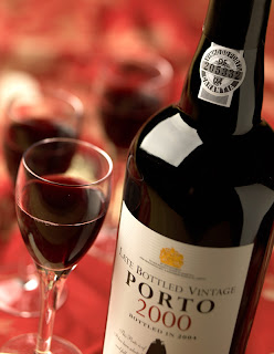
Can you can see the highlights created by adding the shiny patches?
 Now we add some English Ivy and pink Babies Breath to achieve a layered effect.

Here is the final image. Note the extensive retouching done to the label, the two bubbles in the glass, and the selective focus which gives it a soft romantic feeling.


This was one of the first test images. The red background is rather bland and we needed to add some sparkle.


Can you can see the highlights created by adding the shiny patches?


Here is the final image. Note the extensive retouching done to the label, the two bubbles in the glass, and the selective focus which gives it a soft romantic feeling.
Monday, March 01, 2010
Video of Max Factor Shoot
Pete Redel shot this video with his 5D during a photo shoot for Proctor & Gamble's Max Factor. Although I'm not sure about his music choice. Seems kinda violent. Thanks Pete.
Max Factor Photo Shoot from Larry Sherer on Vimeo.
Max Factor Photo Shoot from Larry Sherer on Vimeo.
Friday, December 04, 2009
Medifast Cookbook Shots
We had a great time shooting a cookbook for Medifast just before Thanksgiving. Lisa Cherkaski was the food stylist and as usual did a spectacular job. Paul Meyers & Michelle Wise from Medifast styled some neat backgrounds. We were able to shoot about 8 finals per day which surprised us all.
Here are three of them. To see more, click on one of the images and it will take you to a web gallery.


Here are three of them. To see more, click on one of the images and it will take you to a web gallery.
Friday, November 20, 2009
Trout Unlimited Pocket Knife

This is a closeup of the studio set. If you look really hard, you can find the knife on the rocks. The card on the right is a silver reflector that is creating a highlight on the knife blade.
You can see the camera, lighting, and the capture station with dual monitors. The camera is tethered to the capture station. Each shot is displayed on the large screens.

Here I am adjusting the angle of the knife so the scrim feathers light across the brass part of the knife. You don't want metal surfaces to be all white, or all black. That doesn't look like metal. Metal surfaces should be lit so they gradate from light to dark across their surface.


Sunday, October 25, 2009
Ingleside Vineyards Wine Bottles

Ingleside Vineyards, a Virginia winery, asked us to shoot 16 bottles of wine for their website.
Since the bottles are glass, you are going to see reflections of the lights no matter what you do. So the idea is to create reflections that are attractive and show the shape of the bottle.

Here I have a large soft light box on the right to create the highlight down the front of the bottle. A large white reflector is to the left of the bottle and positioned far enough away so it's barely visible on the glass.

Everything around the bottle has to be black or you will see stray reflections. The white background is about 10 feet behind the bottle so it won't affect the lighting on the bottle.

The bottles are supported high above the black table surface to avoid unwanted reflections.

I wanted a good glow to come through the bottle, but when the back light is increased in brightness, it creates a white fuzzy edge around the bottle. So we shot two different exposures, changing the lighting for each. One of those exposures was just the glow coming through the bottle. In the other shot, the front of the bottle looks perfect. The two images were then combined in Photoshop to create the final.


Here you can see how the reflection of the light shapes the bottles.
Wednesday, September 09, 2009
The Studio

Lobby area and gallery as you walk in.

Same area, different view.

We have a full kitchen for food shoots.

More of the kitchen and our two fridges.

View back toward the entrance.

Studio view showing about 3/4 of the shooting space.

Larry working on a set.
 Pete setting up a shot.
Setting up a shot for Max Factor.


