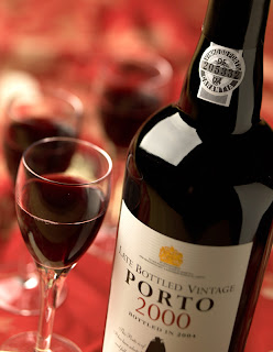
Tom Sadowski art directed a Port wine bottle setup that turned out nicely. The ultimate client was The Center for Wine Origins.
The set up looked like this, except by the time I shot this the glasses had already been removed.
This was one of the first test images. The red background is rather bland and we needed to add some sparkle.
I added some shiny reflective pieces of fabric on the red material to get some "random" looking highlights. You can see them on the left.
Can you can see the highlights created by adding the shiny patches?
Now we add some English Ivy and pink Babies Breath to achieve a layered effect.
Here is the final image. Note the extensive retouching done to the label, the two bubbles in the glass, and the selective focus which gives it a soft romantic feeling.
skip to main |
skip to sidebar
Behind The Lens


No comments:
Post a Comment